The challenge
Moving Ideas create immersive exhibitions and events. It is a dynamic brand, producing pop-ups at art hub venues across the world. A visual identity was required for one of Moving Ideas’ exhibitions. It was to embrace a vision of free-flowing ideas, a super-charged global community, fit for the future. The deliverables were an exhibition programme and poster design. Together, they were to have their own identity, but would express the Moving Ideas vision, which could be flexibly applied to future events.
The solution
The solution
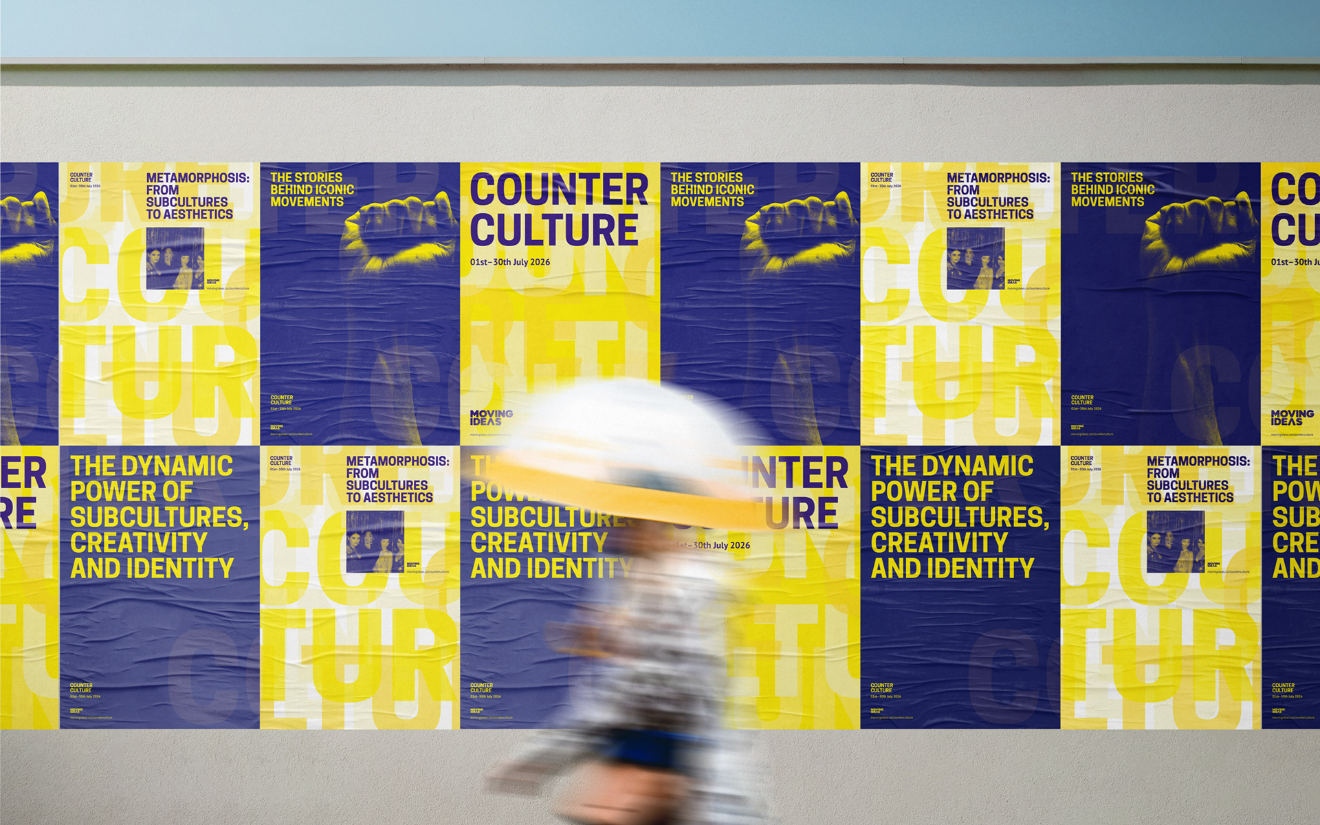
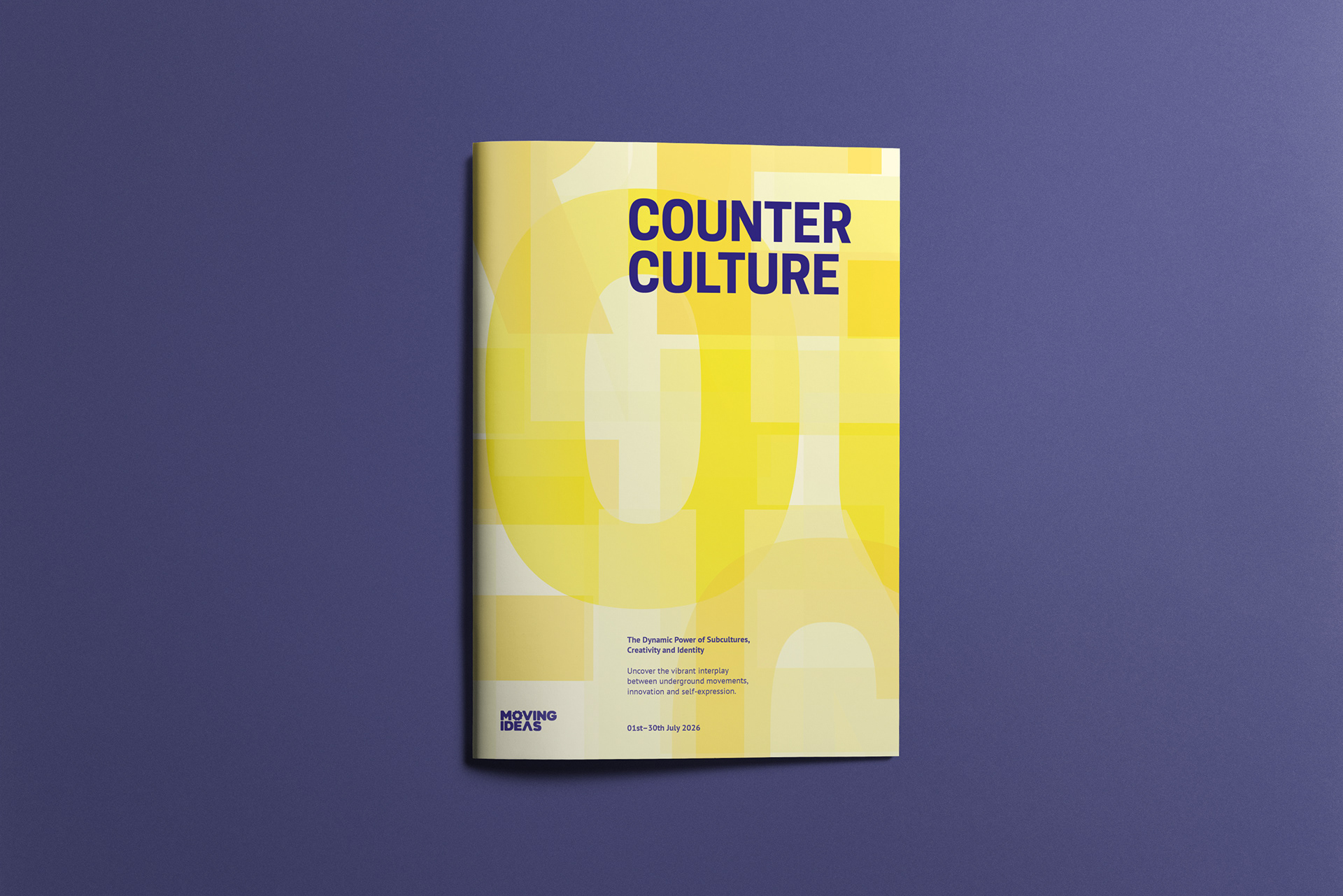
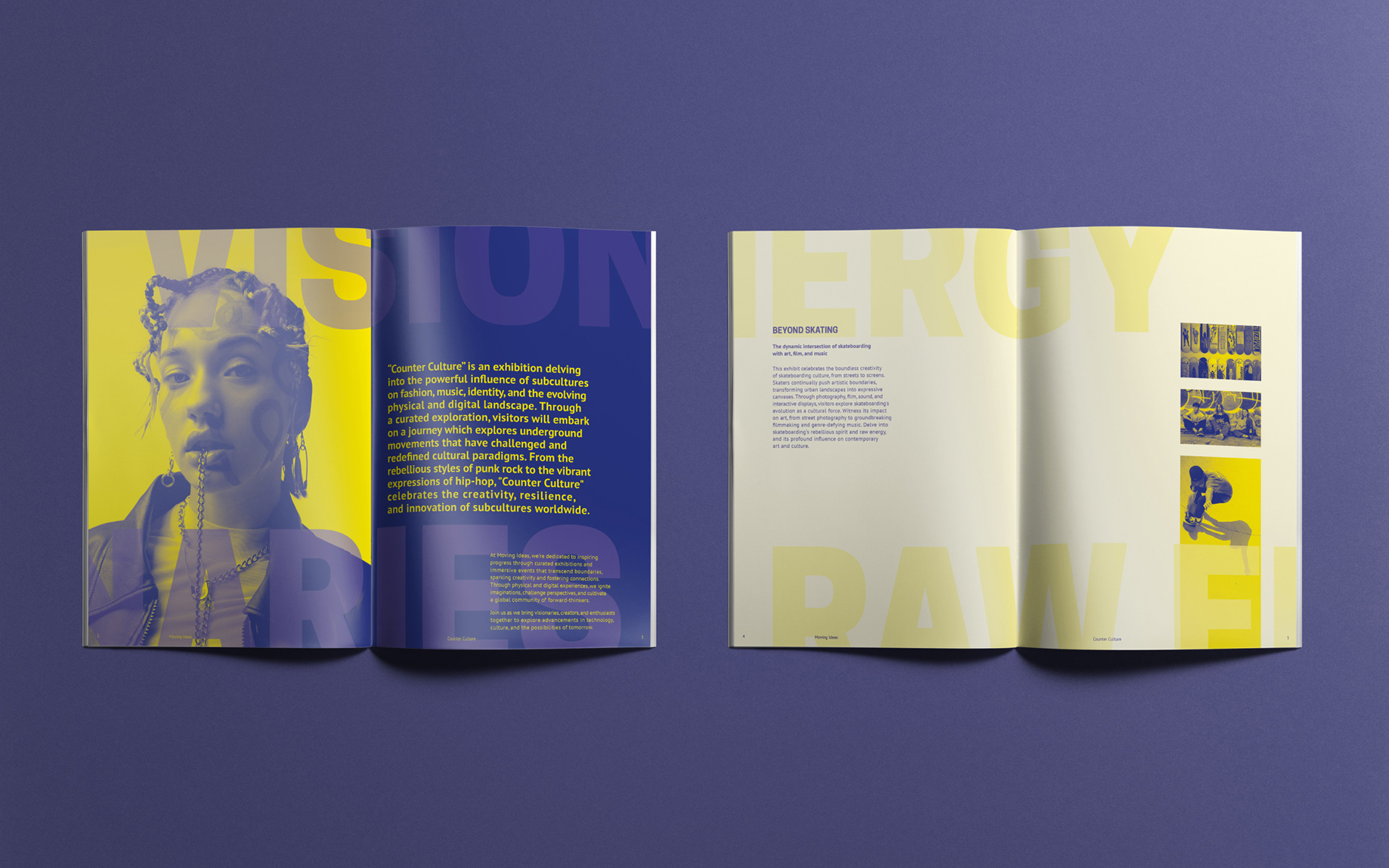
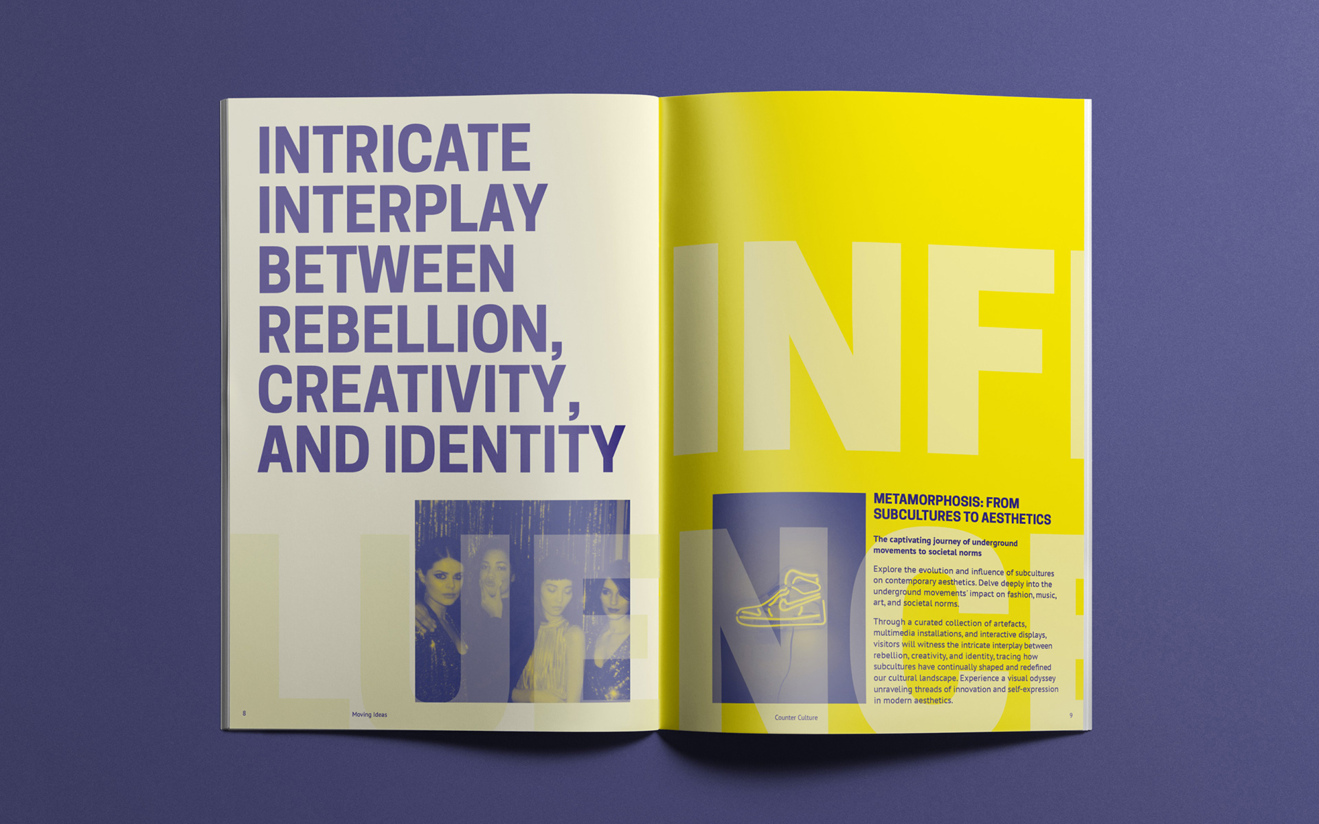
The energy flowing from Moving Ideas as a brand, formed the basis
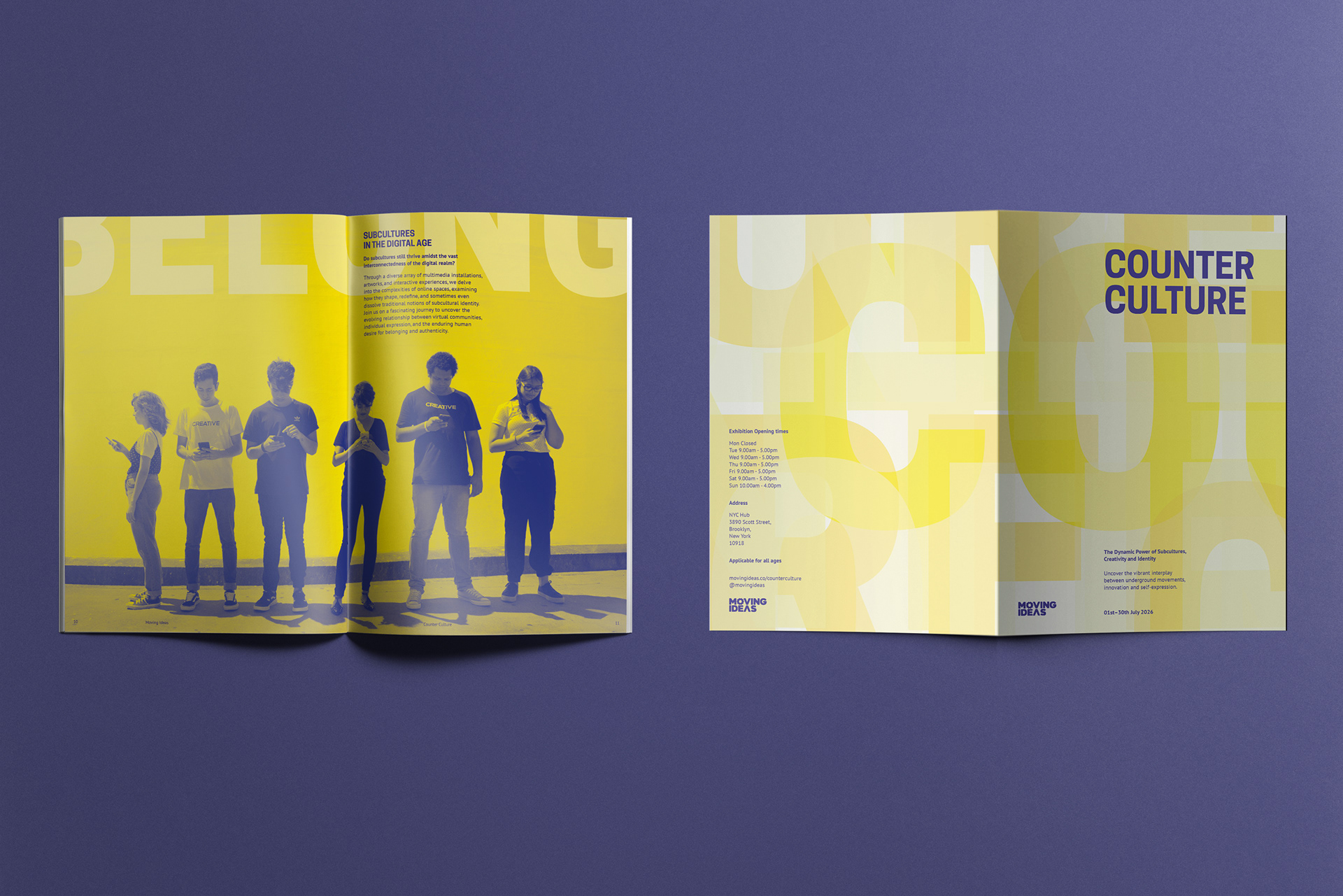
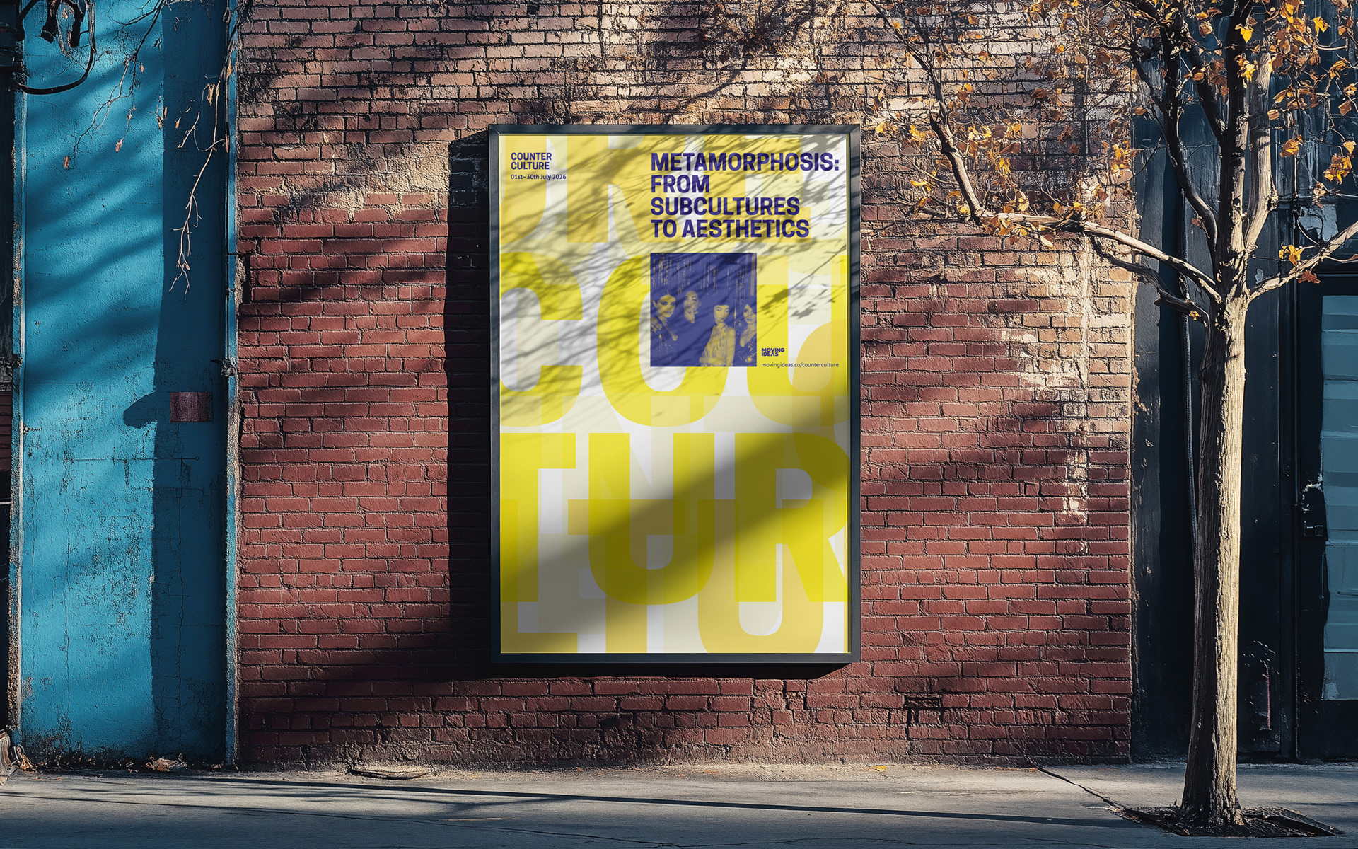
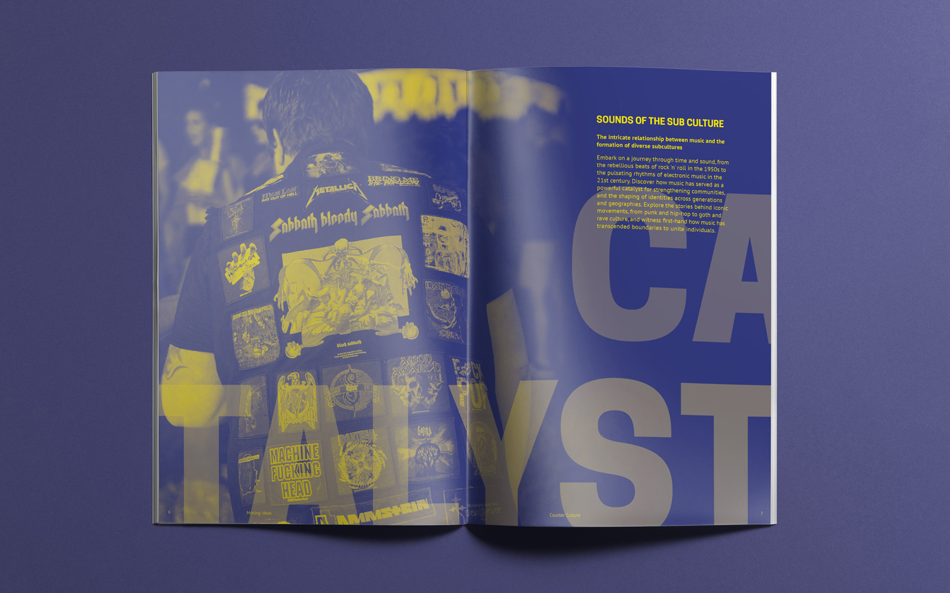
of a concept for the ‘Counter Culture’ design. We see oversized words and images that cannot be contained by the page. Ideas are expanding and pushing forward. There is a suggestion of constant movement: people who know-no-bounds and are eager to explore new ways of thinking. A strict two-colour approach and image treatment suggests that this is something a little out of the ordinary, whilst providing a template for future event designs. The type and smaller images, are set neatly on a grid - a juxtaposition to the expansion of the other elements. The visual style speaks to those who like to be challenged, caught off-guard and enjoy engaging with new ideas.
editorial
typography
print