The challenge
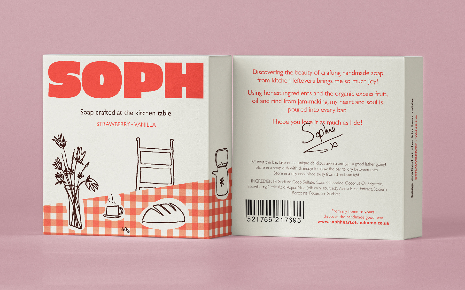
Jam-making entrepreneur Sophie Cooper had the opportunity to scale up her sideline venture of soap-making. She was turning the leftover food scraps from jam production, into soap production. Sophie needed a brand name, branding, tone of voice and a visual approach for her packaging. The target audience, already identified for this project, were retirees living out their best years surrounded by family, friends and a cosy home.
The solution
The solution
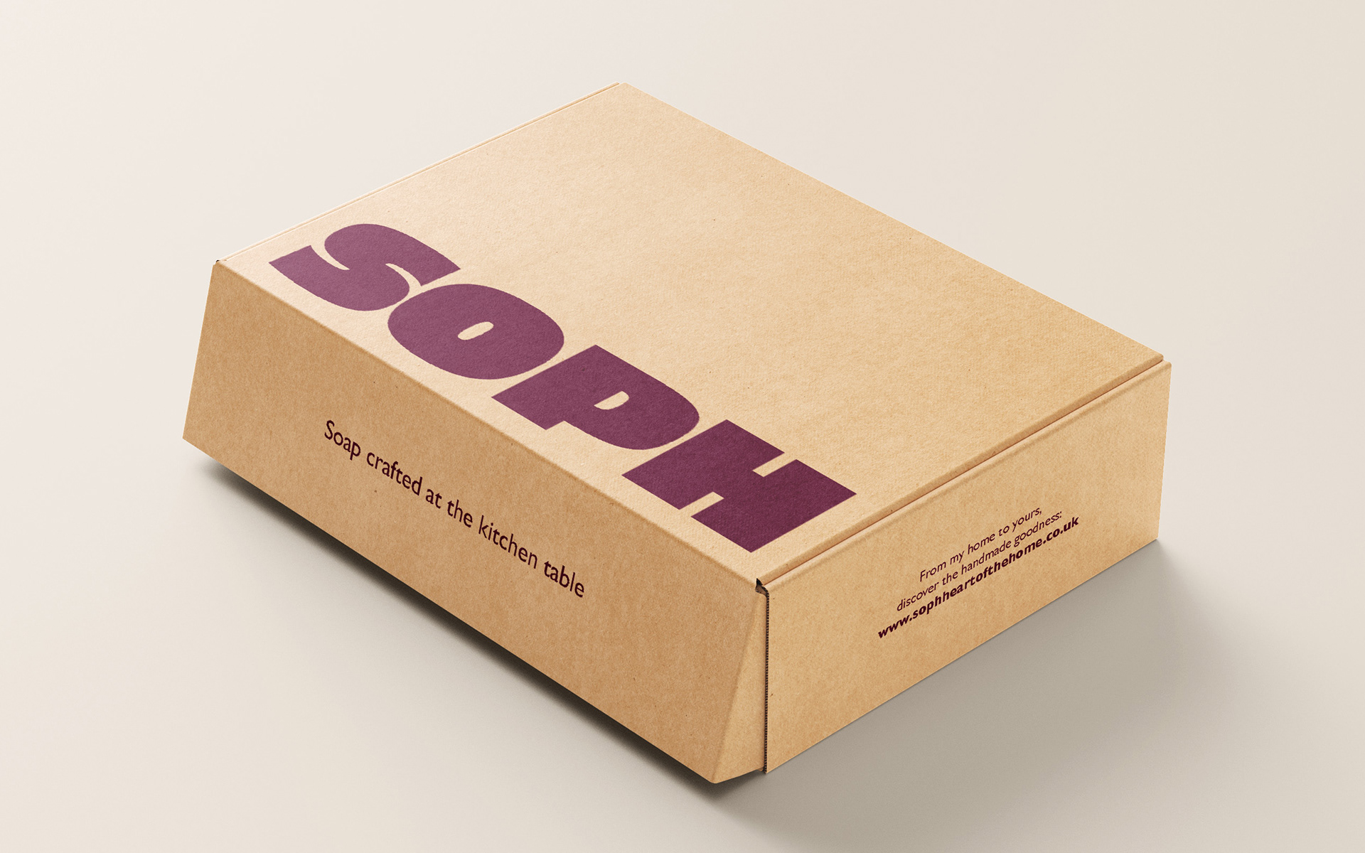
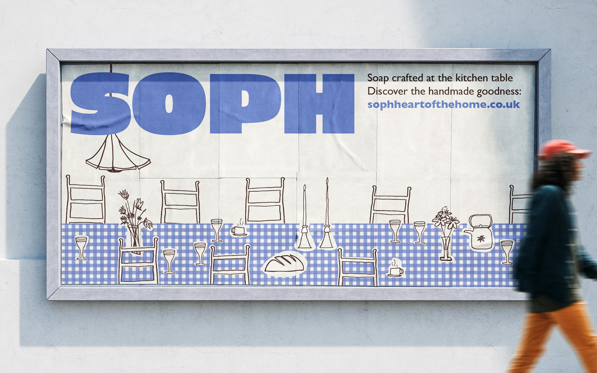
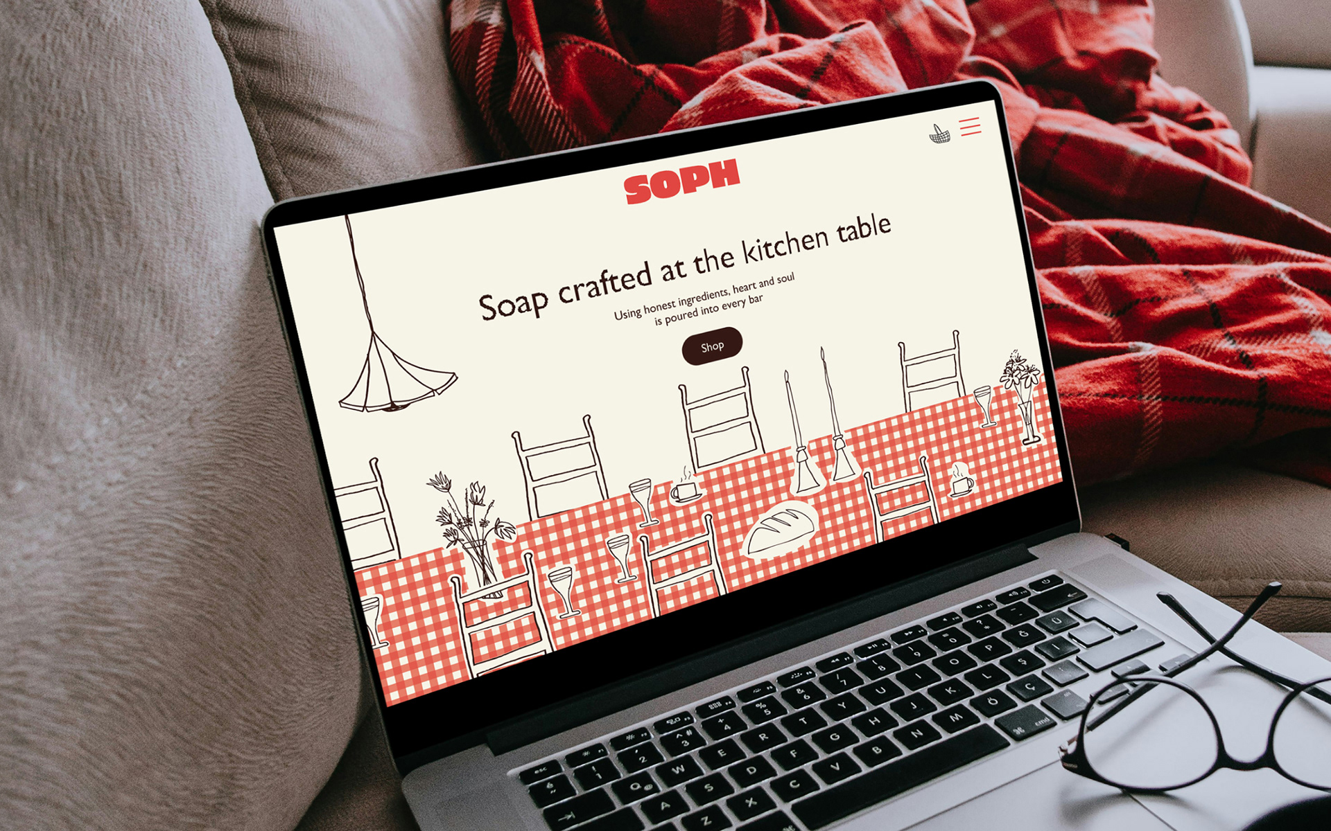
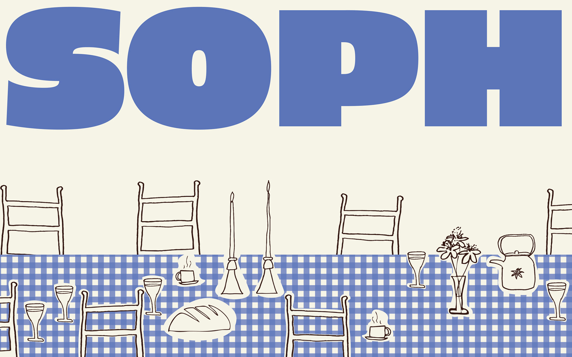
A visual approach developed, embracing the wholesome, relaxed nature of both Sophie - producing soap at her kitchen table - and the target customer - enjoying the heartier pleasures in life. Soap crafted at the kitchen table, at the heart of the home, became the driving force for the brand. From the informal shortening of Sophie’s name for the brand, to the full and plump typeface, the logo oozes personal, homely charm - a big cuddle from mum in the kitchen. Hand drawn illustrations, using a simple line, invite you to unwind, relax and soak up the warm embrace of a deliciously smelling homemade lather.
brand strategy
visual identity
packaging