The challenge
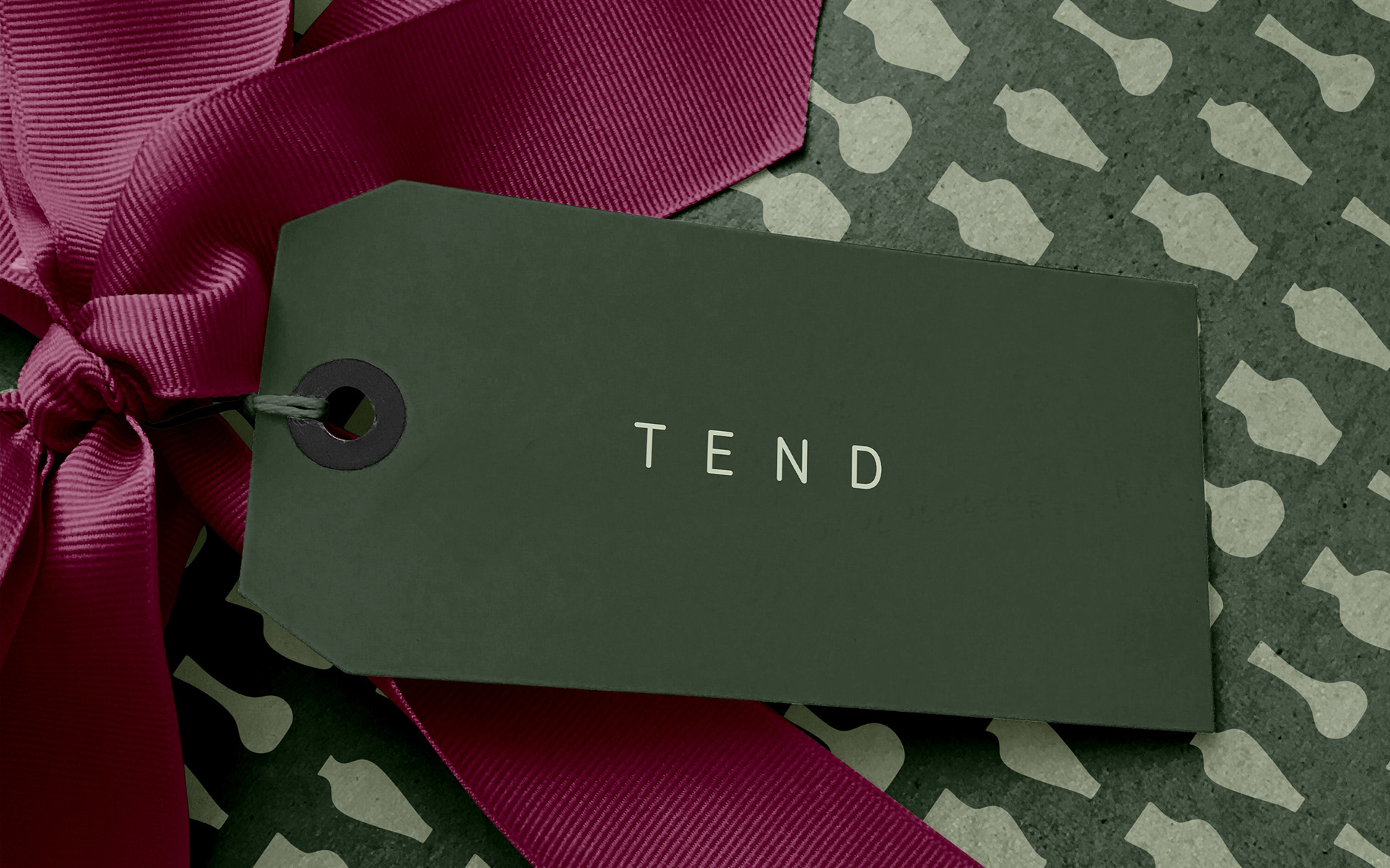
Baby Bio is a long-established houseplant food, ripe for a rebrand.
The name, although well known, no longer sits comfortably in the houseplant market landscape. Launched in 1951, the packaging retained its iconic little shape, based upon a French perfume bottle. Despite launching a number of disconnected new products, to try and bolster the brand in the early 2000s, Baby Bio’s visual identity remained outdated. The brand has poor social media presence and does not connect with today’s houseplant-loving tribe. This audience is the potential future consumer of the product. But, the brand, as it stands, is not on their radar.
The solution
The solution
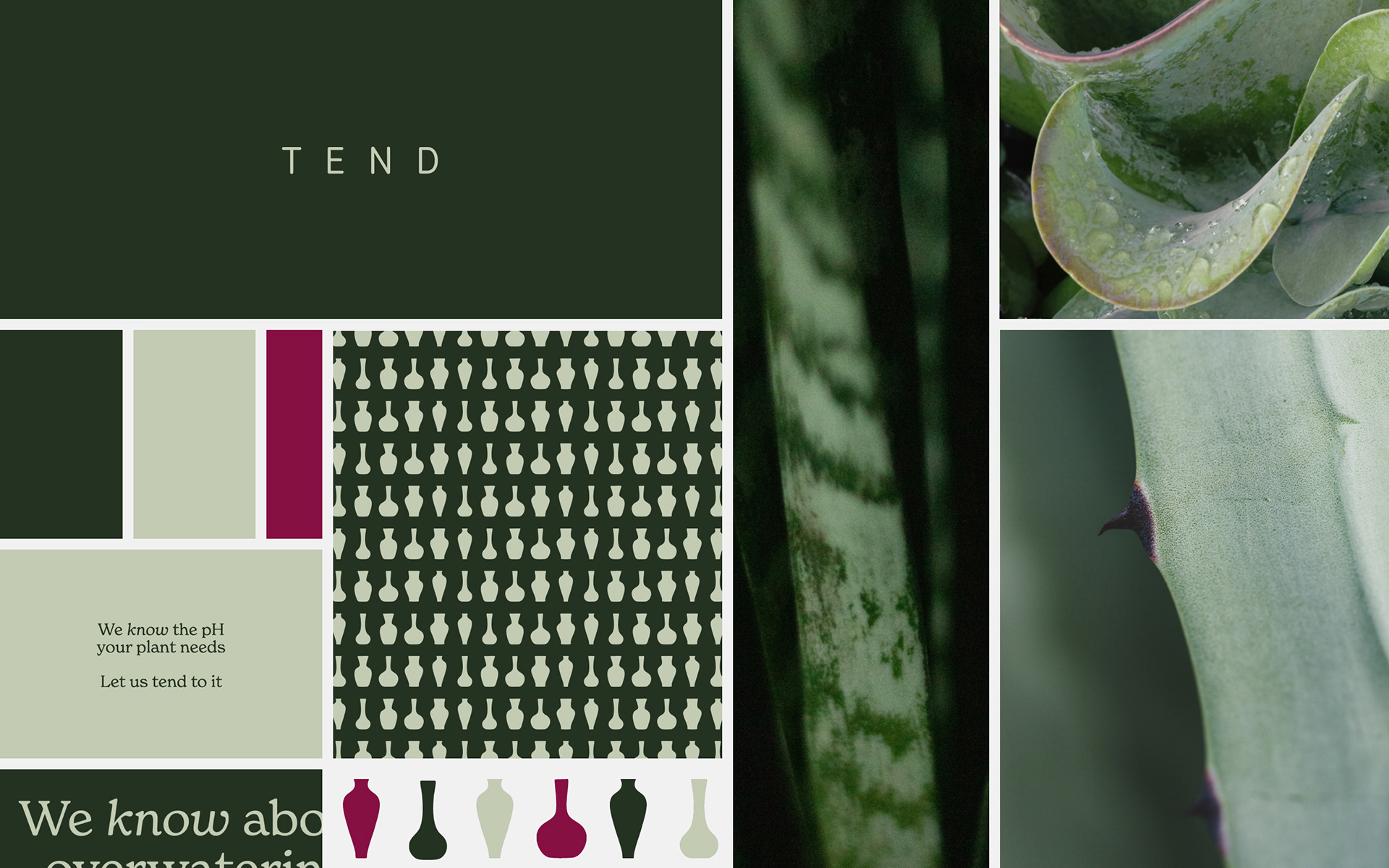
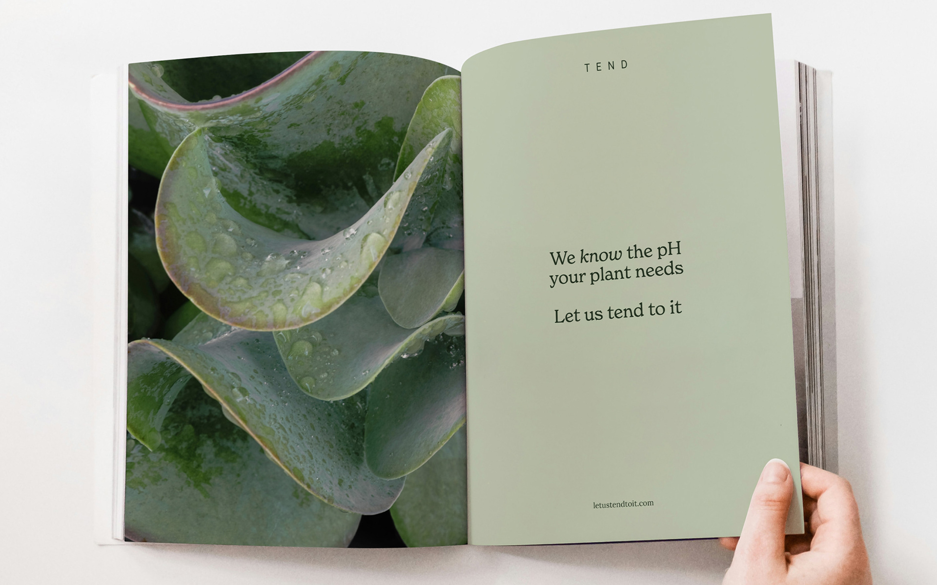
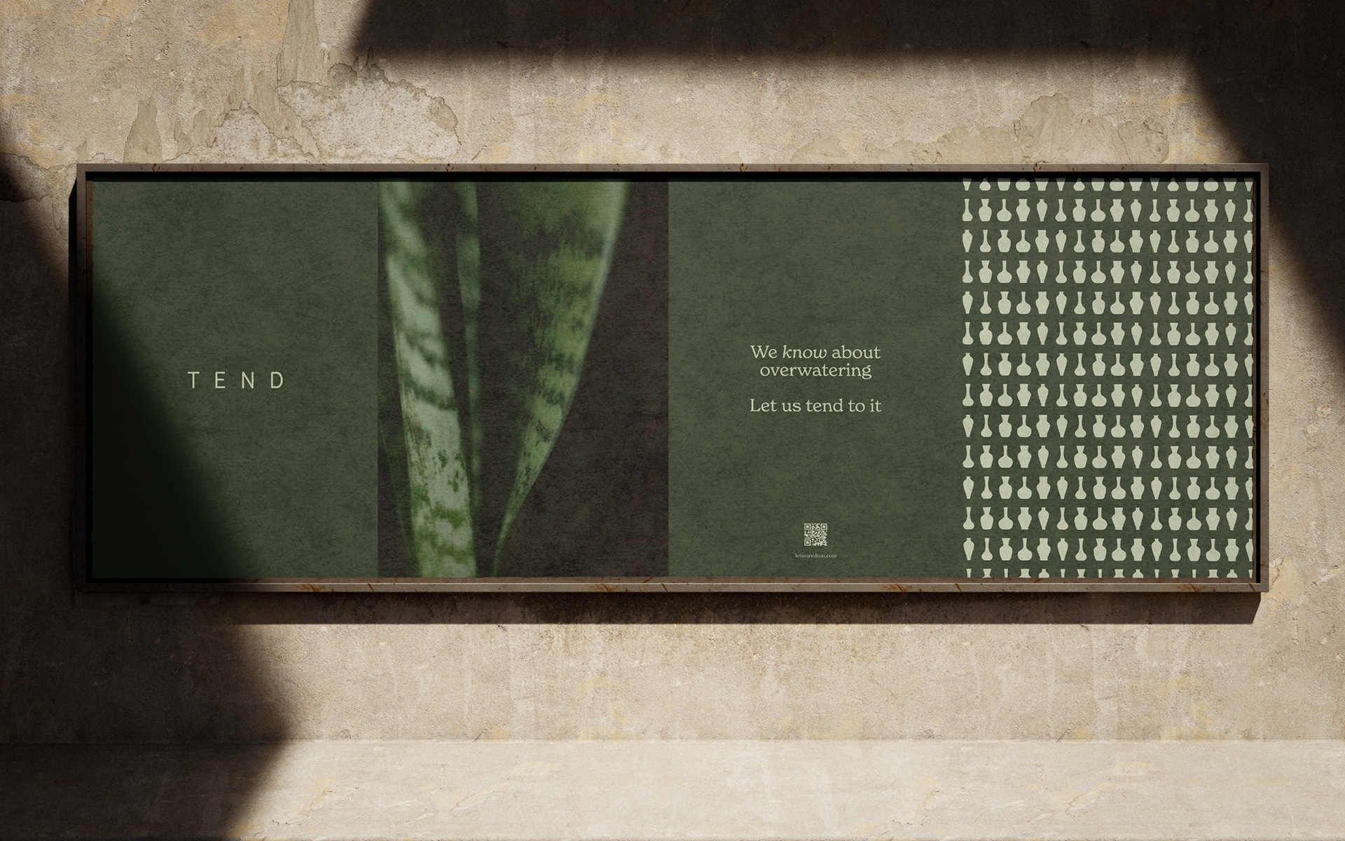
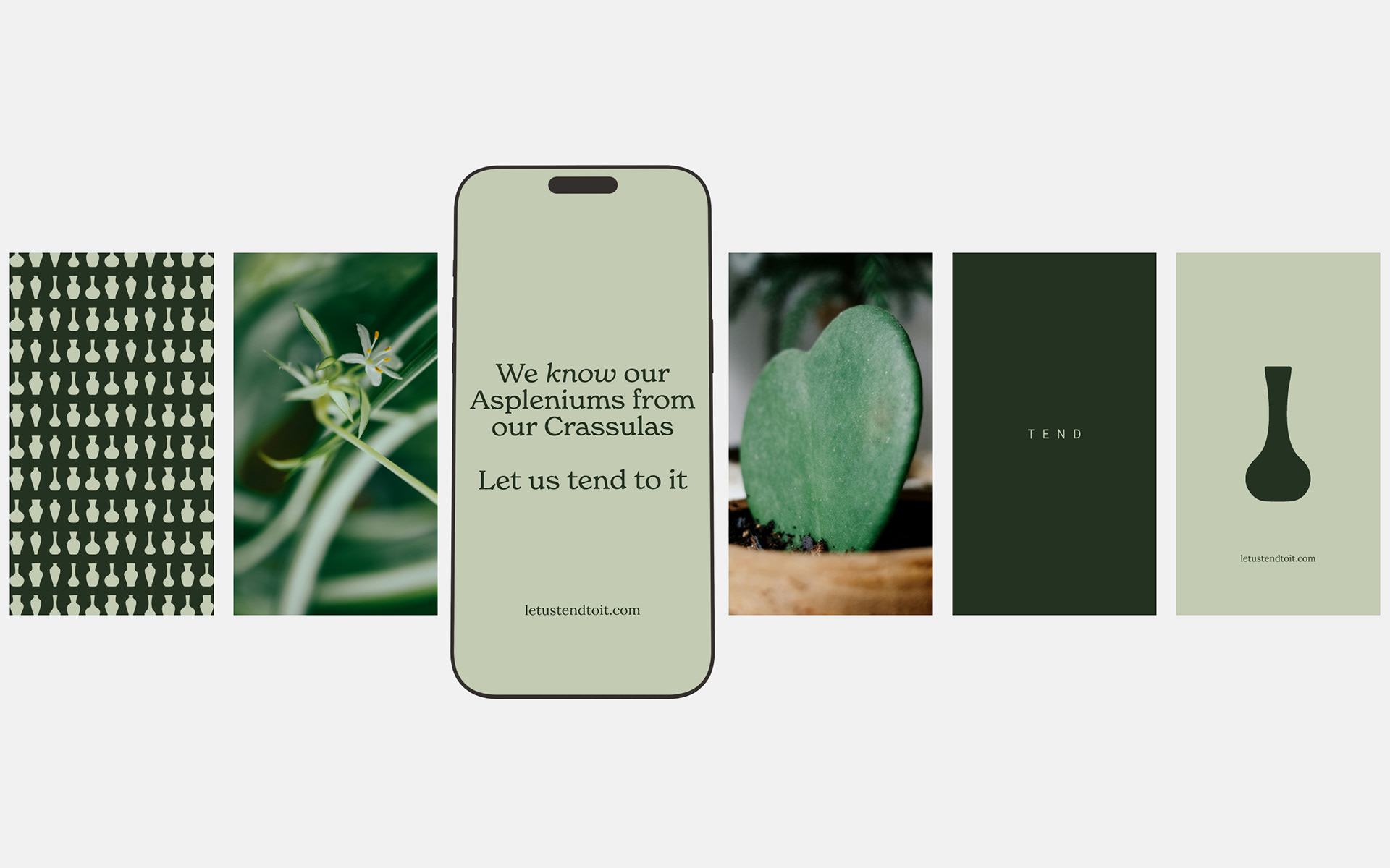
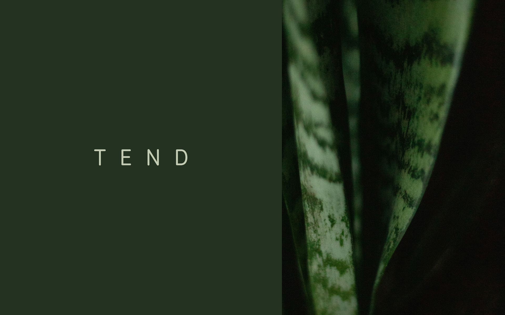
A sensitive and sophisticated approach is taken, keeping fully in mind the long-standing customer base this product maintains. Steeped in horticultural expertise, and having customers who have cared for plants for many years, the rebrand allows the history and skill to sing through. Rather than a product-based approach, a solution that grows an identity for this brand (as an experienced wealth of knowledge) was developed. A charming visual distinctiveness asks to be posted and shared on social media. The art of noticing and appreciating the care and attention paid to plant-raising, seeps through every detail.
rebrand strategy
visual identity
print